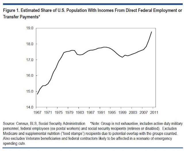
One simple chart showing why America's path is not sustainable.
This should be more aptly called "one of many charts" showing our sad trajectory, but it is food for thought anyway. Note that this is not an exhaustive or comprehensive list as it does not include every American on the dole, but that simply makes the chart this much sadder.
Now recognize the impact of the chart in the context of the debt ceiling discussions. Then ask yourself, what is the point of working your ass off when you are just paying for every soldier, welfare recipient and bureaucrat. Finally, if the Government was structured like a voluntary business how many of these people contribute to a productive economy. Mmmkay then.
Now recognize the impact of the chart in the context of the debt ceiling discussions. Then ask yourself, what is the point of working your ass off when you are just paying for every soldier, welfare recipient and bureaucrat. Finally, if the Government was structured like a voluntary business how many of these people contribute to a productive economy. Mmmkay then.


Comments
Post a Comment